In our image-obsessed society, a brand defines a company. It's the way businesses show who they are, earn customer loyalty, and set themselves apart from rivals. Graphic designers do more than just make logos and pick colors, they shape the visual core of a business. Their role in branding is crucial, whether they work for a new startup or an established company. Let's take a closer look at what it means to mold a brand.
What is Branding?
Marty Neumeier, a branding expert and author, defines a brand as "the gut feeling a person has about your product or service". A brand is a result. It's a customer's gut feeling about a product, service, or a company. It's not what you say it is, it's what they say it is.
Not just a logo or catchy tagline, branding includes the entire experience a company offers through its imagery, messaging, and presence. At its core, branding is the way a customer perceives a company or product. Clear, consistent, and trust-based communication helps a brand establish an emotional connection with its audience.
A graphic designer's role is to guide the process. They translate abstract ideas like luxury, trust, or creativity into visual elements that the target audience will find appealing.
The Role of a Graphic Designer in Branding
When it comes to branding, graphic designers are frequently at the forefront. Their work is a continuous process that permeates every touchpoint of a brand's communication, and we strive to visually convey the essence of a brand in a single piece. Designers are in charge of making sure that every visual component, from business cards to product packaging, from social media templates to website layouts, is in line with the brand's message.
However, it transcends beauty. Understanding a company's mission, values, target market, and objectives is the first step in creating a successful brand. To get to the core of the brand's values, graphic designers must pose the appropriate queries. Here are a few crucial steps in the procedure:
1. Research & Discovery
Understanding the goal, target market, and distinctive features of the brand is crucial before designing. This lays the groundwork for the design procedure.
2. The process of conceptualization
During this phase, ideas are generated and visual experiments are conducted. To make sure the brand successfully conveys its values, it's important to strike a balance between creativity and functionality.
3. Logo Design
A brand's logo is frequently its most identifiable component. A good logo should capture the essence of the brand and be straightforward, memorable, and adaptable.
4. Consistency
Being consistent is really important when it comes to branding. When everything, from ads to how customers are treated, feels cohesive, it builds trust and shows that the brand knows what it stands for. That kind of reliability helps people feel more connected to the brand and sets the stage for long-term loyalty and success.
5. Testing & Refining
Following creation, designs are tested to make sure they function properly in a variety of settings and platforms. Making the design better is key to making it functional and appealing.
Why Branding Matters?
Branding is essential because it influences how the public views your company. A strong brand communicates your values, builds trust, and emotionally connects with your audience. It makes you stand out from the competition, boosts recognition, and cultivates client loyalty. In addition to attracting new customers, consistent and strategic branding enhances your business's legitimacy, recall, and market power over time.
Here are a few examples:
- Apple
Apple’s branding focuses on simplicity, innovation, and premium quality. Its clean design, consistent messaging, and iconic logo create a strong emotional connection with users, making Apple products instantly recognizable and desirable worldwide. - Glossier
Glossier built its brand around real people and user-generated content. With soft colors, minimal design, and a strong online presence, Glossier created a modern, approachable, and inclusive beauty brand that feels like it’s made by and for its community. - Coca-Cola
Coca-Cola’s consistent use of its red color, script logo, and messaging centered on happiness and sharing has created one of the most recognizable and emotionally resonant brands in the world. - Pangaia
Pangaia is a sustainable fashion brand that uses science and tech-driven materials. Its branding is rooted in environmental responsibility, with minimalist designs and educational labeling. Pangaia appeals to a growing market of eco-aware consumers who want both style and substance.
Tips for Aspiring Branding Designers
- Understand the Business: A deep understanding of the client’s goals and audience is essential.
- Stay Consistent: Consistency across all media builds brand trust.
- Keep Learning: Branding trends and tools evolve—stay updated to stay relevant.
- Seek Feedback: Iteration is key—refine your designs based on feedback.
Rebranding
Rebranding is a strategic process that aims to revitalize and redefine a brand's identity by altering its name, logo, visual style, messaging, or overall market positioning. It involves altering public perception, maintaining customer loyalty, and carefully managing the transition to avoid misunderstandings. Rebranding is more difficult than initial branding, which starts with a blank slate. It involves eliminating familiar elements and introducing new ones that must appeal to viewers both now and in the future.
Here are a few successful examples of Rebranding:
GODADDY DITCHES THE NERD WITH THEIR REBRAND
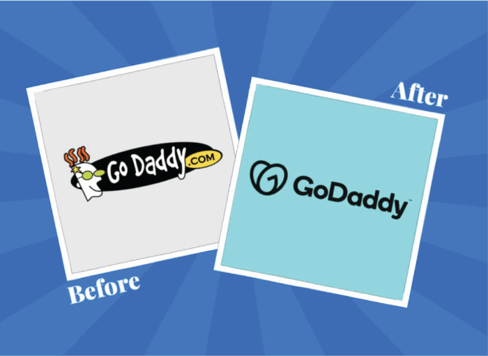
Old :
The problem GoDaddy was facing with their brand, in all honesty, was not being taken seriously.
GoDaddy, as historically problematic as they are, managed to pull off one of the best rebrands in the last several years.
New :
They were able to change their brand identity in a way that retains character and completely modernised the brand. This elevated them to be seen as the professional organization they are.
ADOBE EMBRACES CREATIVITY
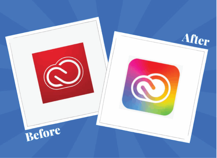
The company certainly didn’t struggle with brand recognition, even in the early years.
It created some of the most innovative and advanced products for design in the world. Things like Photoshop and Illustrator are still the industry standard today. The only problem? Adobe’s image just didn’t reflect its
core purpose. Adobe decided to infuse its creative style into its Creative Cloud catalog, changing new color schemes, fonts, and components. Adobe said the design changes weren’t just aesthetic; they were also intended to help customers navigate its products more effectively.
Here are few failed examples of Rebranding
TROPICANA- PACKAGING REDESIGN DISASTER
Spent $5 million on rebranding
Lost $50MILLION in sales
Tropicana- Packaging Redesign Disaster
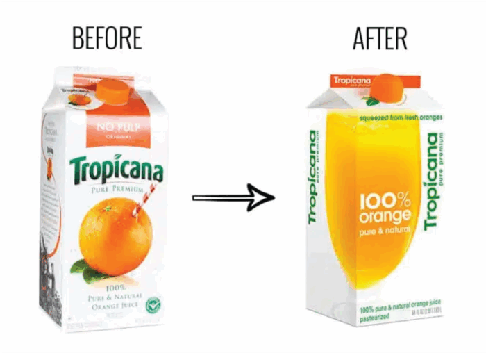
The design changes were extreme, making the product almost unrecognizable to customers. It replaced the orange with a straw sticking out of it with a glass full of orange juice. There were also other changes, including in the logo design. Consumer backlash ensued. The brand received criticism from consumers almost instantly, especially on social media, and even rejection of its product. It soon became evident that the new packaging and accompanying advertising campaign were a failure. The company had no choice but to return to the original design.
NEVER FORGET THAT UTTERLY RIDICULOUS PEPSI LOGO DESIGN DOCUMENT
The rebrand included a new logo with a white wavy stripe that was meant to look like a smile. However, the design was inconsistent across packaging and some consumers were confused by the logo.
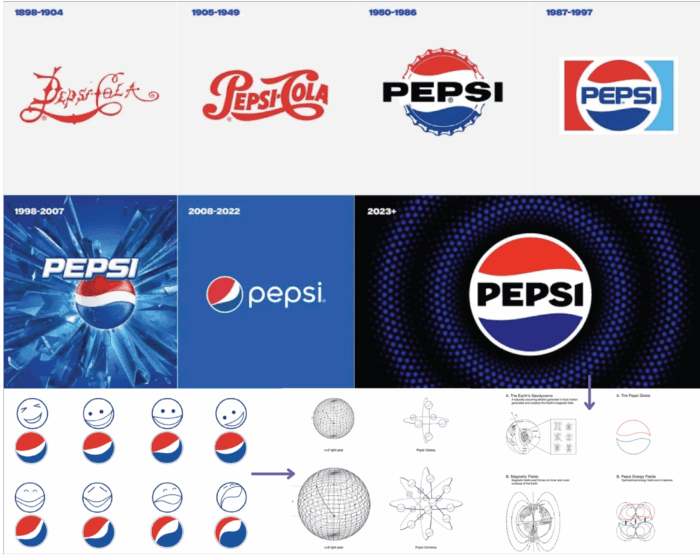
Pepsi's 2008 logo rebrand
cost $1 million.
With the news that Pepsi announced a new logo, it was time to say goodbye to one of the more divisive designs of the past 15 years. Fans called the simpler, straighter and bolder new logo a "massive improvement" over the slanted ‘globe ' introduced in 2008. As well as the logo, people have also been saying farewell to perhaps the most ridiculous, hilarious design document of all time.
The result: confused customers and a waste of $1 million. Yes, Pepsi paid $1 million for this small change.
AND LASTLY, THE “GAP” UNNECESSARY REDESIGN LOGO
Gap’s new logo costs a shocking $10 million.
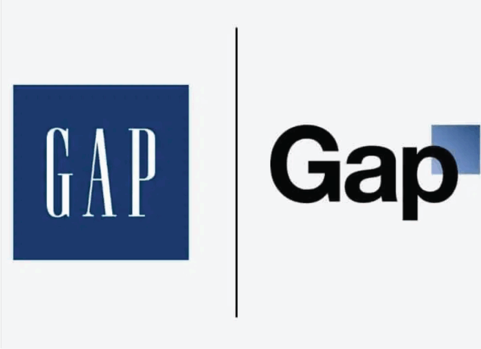
The GAP Backlash Consumers Revolt: The new GAP logo triggered an immediate and overwhelmingly negative reaction from consumers and branding experts.
Social media erupted with criticism:
Twitter: A protest account [@GapLogo] quickly amassed thousands of followers.
Facebook: GAP's Facebook page is flooded with unfavourable comments.
Parody: A "Make Your GAP Logo" website went viral, showcasing thousands of satirical redesigns.
Conclusion
Graphic designers are the ones who develop the branding that businesses require. By understanding the brand, creating memorable designs, and staying consistent, you help businesses build long-lasting relationships with their audiences. A company that has a strong brand can differentiate itself from the competition.
For branding, rebranding, or any other digital marketing needs, contact c3digitus.


